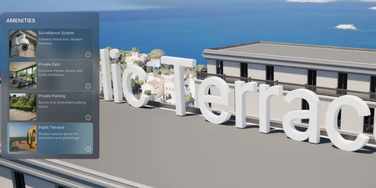
POI Reactable – Animated 3D Text
Displays animated 3D text when a POI is selected. Can be used for titles, labels, or descriptions tied to specific points of interest.

Displays animated 3D text when a POI is selected. Can be used for titles, labels, or descriptions tied to specific points of interest.
The Floating Pawn Movement component was removed from the pawn because its built-in acceleration and deceleration settings were difficult to tune, resulting in floaty panning
Prevents unintended camera movement or interactions when the user starts a touch or mouse drag on a UI element (like a panel or border). Blocks
When the user clicks, display a small indicator icon at the orbit location beneath the mouse cursor. This gives clear visual feedback about the pivot/orbit
Refactored button-slot widget communication to use Common UI’s FindParentWidgetOfType combined with Event Dispatchers, replacing downward Blueprint Interface calls. This improves modularity and decouples child-parent dependencies
Enables the Gallery system to dynamically create and manage independent Media Player instances for each video item. This allows users to play and view multiple
Initially, the Media Entry widget was styled and configured using a Common List View, relying on the OnListItemObjectSet event. This worked well for image-only galleries.
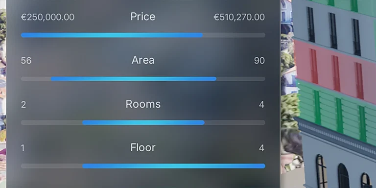
Custom dual-handle range slider for defining both lower and upper bounds. This widget features snapping logic that utilizes normalized values for precise filtering. Replaces Unreal
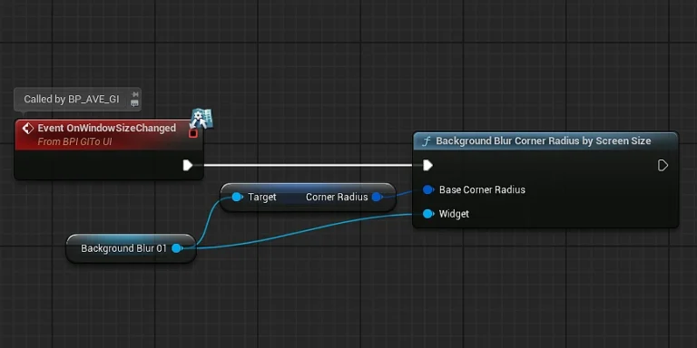
Global function (BackgroundBlurCornerRadiusByScreenSize) that dynamically adjusts the corner radius of all background blur elements based on the current viewport dimensions. The function calculates a scaling